

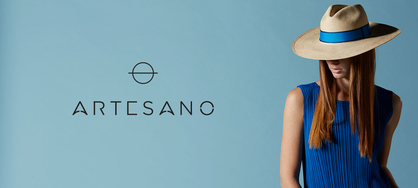
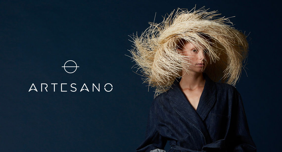
Branding / Logo
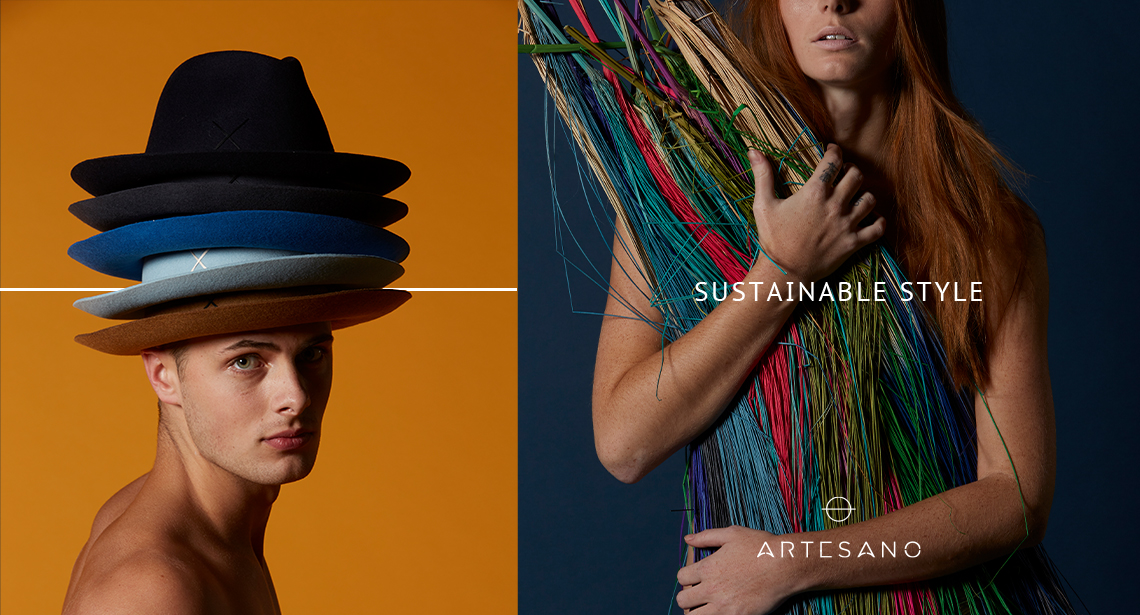
Artesano’s fashion-forward hats represent the highest quality products and craftsmanship for the most discerning of tastes. They are a brand that represents a community and lineage of talented hat makers in Ecuador, and directly support rural communities and their artisans by encouraging the survival of cultural traditions. They wanted new branding and a logo that could best represent them to their potential customers, that resonated well with their deeply rooted crafts heritage, married to a modern, hip sensibility.
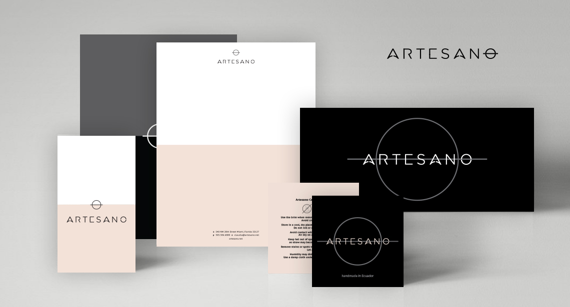
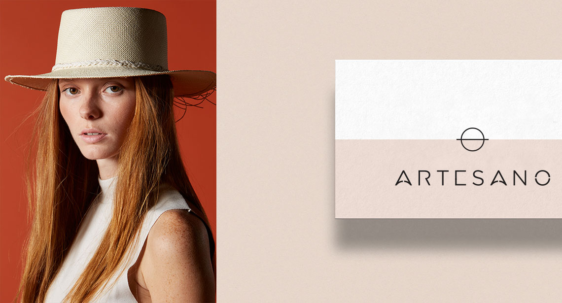
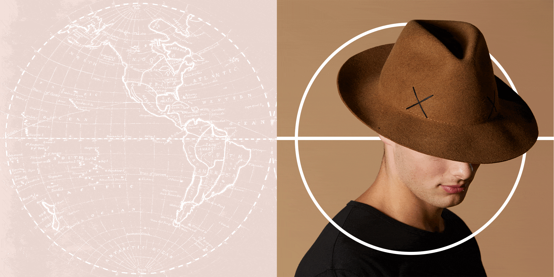
We created a custom sans serif font with a narrow silhouette that was both contemporary and timeless. The “O” in the name, with a line drawn through it, can serve as an icon on its own, as well as evoking the globe bisected by the equator, which is what Ecuador means in Spanish and is also where the country is located. The rounding of the crossbars in the “A” mirrors the curves of the earth, and is a reference to the environmentally sound, culturally respectful hats from Artesano. The logo works beautifully on a range of collateral, from letterhead to business cards to marketing displays, and is paired with the simple, pastel colors of black, gray, white, turquoise and salmon.
Project included:
• Logo design
• Supporting collateral, letterhead, business cards, apparel, signage, marketing
• Style guide
 DEA MAIA
