In this world where everything is shared, tagged and or commented on, businesses need that little something extra to pop. The best place to start for any company (non-profit or for profit) is the name and the logo (of course).

In this world where everything is shared, tagged and or commented on, businesses need that little something extra to pop. The best place to start for any company (non-profit or for profit) is the name and the logo (of course).
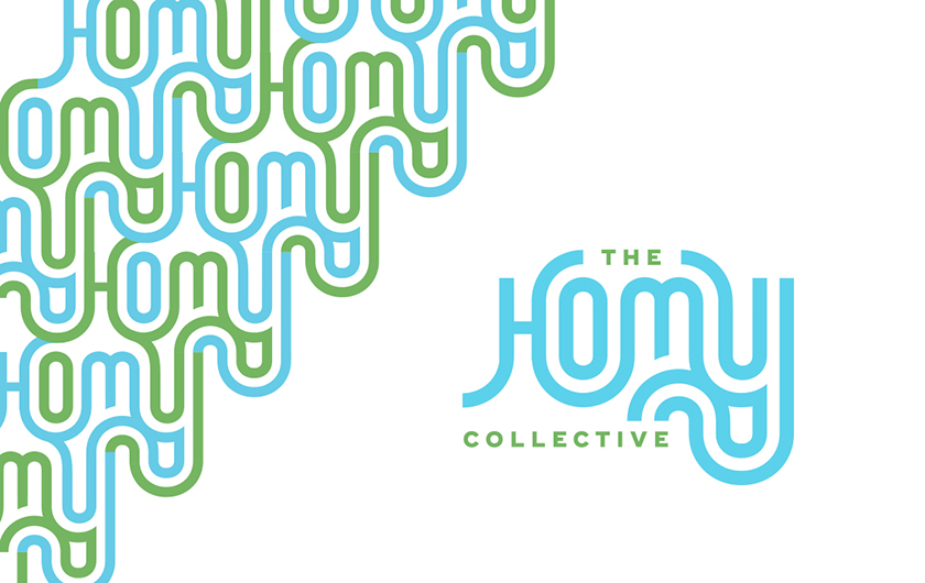
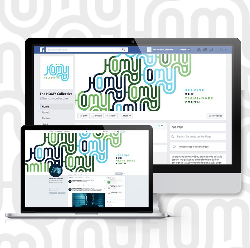
Recently, Jacober Creative was tapped by the Miami Homes For All founders to help craft an official name and a logo for one of their groups. They wanted a new identity to help rebrand what was formerly known as the Youth Homelessness Initiative in Miami-Dade County as a leader in the community. And so the new H.O.M.Y. Collective, which stands for Helping Our Miami Youth, was born.
The H.O.M.Y. Collective is a collaborative of over 60 organizations and youth leaders working to prevent and end youth homelessness in Miami-Dade County. To help them stand out we worked on finding a catchy and familiar name with some fresh and dynamic branding to match.
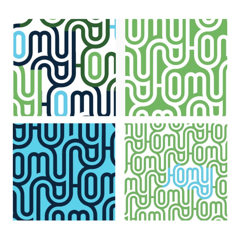
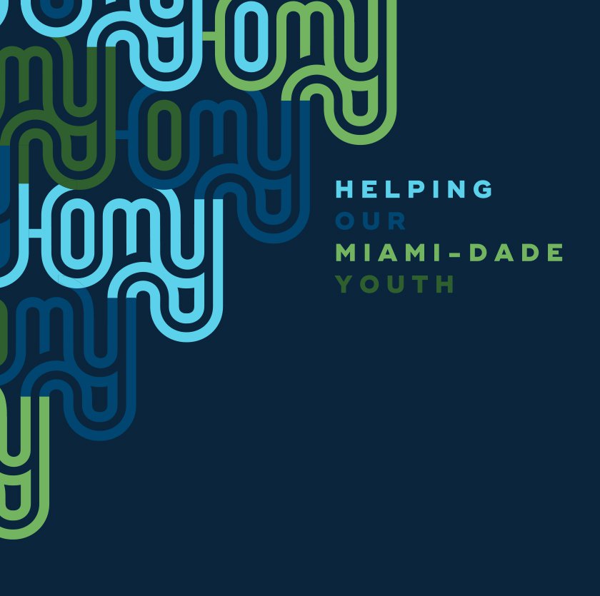
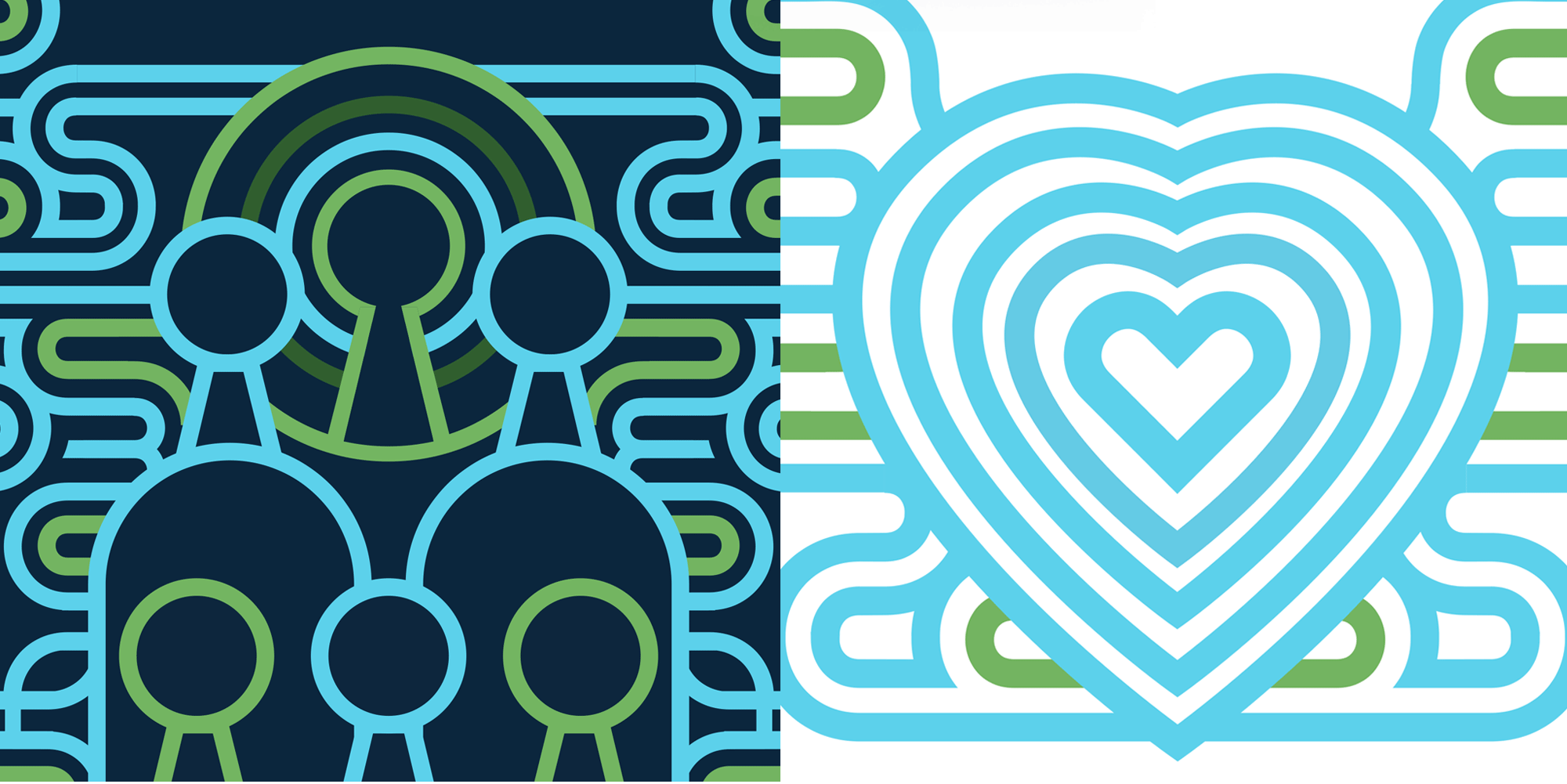
The Design: For the initial name and design, we took inspiration from the concept of the “collective”and explored the idea of the different and unexpected turns that life can take and that can lead to homelessness. We married that idea with a sense of place (Miami). What we came up with is a wavelike icon that ebbs and flows with radiating letters that form a strong, simple and readable typographic logo. The movement in the logo is also an abstract representation of life’s various challenges as well as the idea of moving forward.
“We’re very proud of the H.O.M.Y logo and can honestly says it is one of our new favorite creations, “ said Paul. “There's an element of simple geometry to it, like waves expanding in the ocean or rays of sun emanating from the sky.”
Looking for a Creative Agency? Are you a non-profit looking for a design agency to bring your organization to life? Jacober Creative is an award-winning creative firm that specializes in graphic design, branding, logos, digital marketing, websites and video production, and excels in the non-profit space. We are passionate, hard working and have the experience to help you create an organization that will stand the test of time. Let’s work together! [Contact Us]